Winning the digital diner: How top F&B brands streamline the ordering process

In our last post, we looked at what opportunities there were for F&B brands to increase direct orders and build stronger customer relationships.
Here, we explore how brands can streamline the ordering process and what best practice looks like, using the top scorers from the report.
---
When a hungry diner lands on an F&B brand’s website, they’re generally looking for three things: is there tasty food they want to (and can) eat, is there a location nearby, and can they place a to-go order online? These are the essentials that F&B brands need to get right in order to engage today’s customers, and, from the moment they land on the website, it all needs to be easy to find.
As part of our research into the digital customer experience of 20 leading UK and international F&B brands, we assessed each for how easy it was to navigate their websites, identify whether food could meet specific dietary needs, and place an online order.
Below, we share how some of the top-performing brands from this recent digital CX research are delivering on these fundamentals, as well as on tasty food.
YO! Sushi – Winning with seamless navigation
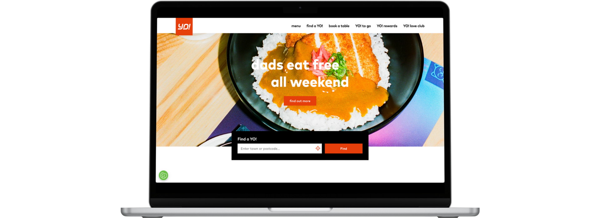
YO! Sushi’s came joint second in our benchmarking research, and its website is a great example of navigation done right.

YO! Sushi’s top-of-the-page nav takes diners wherever they may want to go – from the menu to the location finder, as well as to the ordering page. This is complemented by the location finder in a prominent place, plus further CTAs to view the menu and order click & collect down the page.
The top navigation isn’t overcrowded yet enables customers to access all the information they could want to make an ordering decision: the menu, a location finder, its online order capabilities, as well as the loyalty programme as an added incentive to order direct (which we’ll discuss in more detail in the next post).
YO! Sushi also doesn’t skimp on promoting its menu and the ability to order online as you navigate through the site – as you scroll down the home page, you’re greeted with the newest additions to the menu and plenty of opportunities to place an order.
The location finder also offers the full spectrum of functionality, with diners able to use their physical location, postcode or town to locate the nearest restaurant. And the brand scored top marks for location information, including facilities, opening hours and contact details – something not all brands provide.
Wagamama – Winning with transparent menus
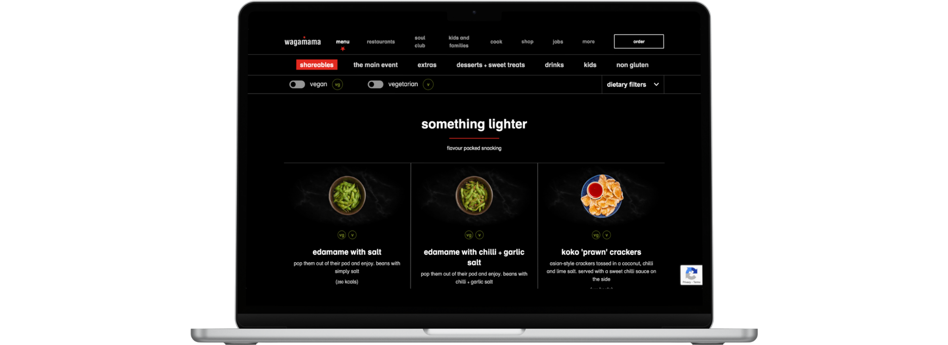
A common bugbear when it comes to online menus is not being able to easily identify items on the menu that meet dietary requirements. Having to click into each item to see whether it’s suitable can be frustrating and time-consuming – especially since it’s incredibly easy to include that information at a top level. As Wagamama does.
Not only does Wagamama include icons on the menu pages to show which items are vegetarian or vegan, the brand also offers very comprehensive filtering options, allowing diners to filter by veggie or vegan dishes and exclude items that contain allergens.

Wagamama clearly labels its food as being veggie or vegan friendly, making the easy to pick out when scrolling through the menu. Have an allergy? The filtering function allows you to exclude items that contain the allergen.
Something to keep in mind when including a filter for your menu is to put it in a logical place. The top brands in the report all included filtering options at the top of the menu in a visually prominent place – and where customers would expect this functionality to be. While innovation and thinking outside of the box can be a good thing, sometimes it’s best to stick with the tried and true when trying to create a seamless online journey.
GKB – Winning with online ordering and an accountless checkout
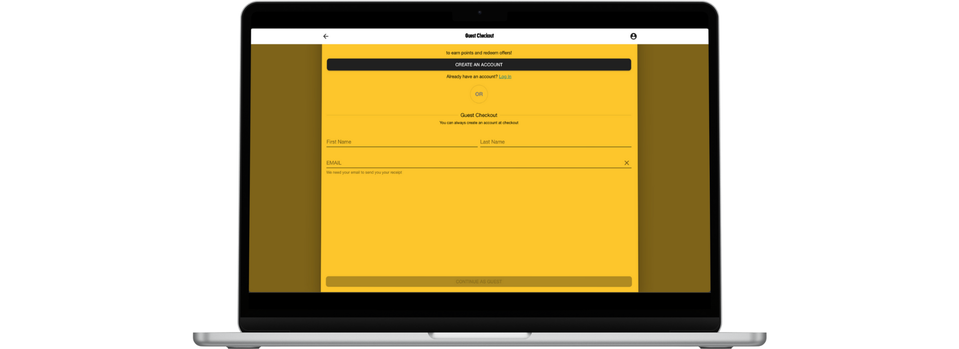
GBK’s website’s strengths lie in its simplicity. While the brand has an app*, it ensured all the important stuff is accessible via the website – including ordering its delicious food online without having to create an account, requesting only minimal information to complete an order.

Name and email address are all that’s needed for a diner to complete their click & collect order from GBK. Surprisingly, being able to check out without creating an account was only offered by 45% of the brands in the report.
Customers are also able to set a pickup time and extensively customise their order, showing that the brand’s there for the customer, rather than the other way around.
As a bonus, post-order follow-up communications are clear – the confirmation email includes all relevant information about the order, pick up time and location, reassuring customers their order has been received and, if something goes awry, they have all the information on hand to help them rectify any issues.
*Quick note: When we initially assessed the site, GBK was promoting its app and loyalty scheme through the website. At the time of writing this post, the app and loyalty scheme are no longer being promoted, though the app is still available to download.
The opportunity for F&B brands
The above examples show how the best-performing F&B brands in our report are delivering online ordering experiences that are free of friction and aligned with evolving customer needs: they make relevant information easy to find and don’t gatekeep placing an order behind a need to create an account or download an app.
This is the second post in a three-part series looking at how F&B brands can address points of friction in the digital ordering journey that are keeping customers from ordering direct. Click here for part one and here for part three.
Want the full picture?
See what other areas of the digital experience we assessed and how F&B brands are performing against them by downloading the report.
Inside you’ll find:
• The full ranking of the 20 F&B brands
• Best-in-class digital CX examples
• The full spectrum of the experience we assessed, and how the brands performed
• Actionable recommendations to improve your digital journey


