

Digital accessibility was a key focus for Inviqa’s research into the digital experience of 20 UK university websites during clearing. Not only are there ‘legal’ imperatives, it’s also the right thing to do to make the university selection process convenient and stress free for all students.
Applying to university is already emotionally charged, especially for students with disabilities who may also need to gather evidence for their Disabled Student's Allowance, organise support, or prepare to leave home for the first time.
The first interactions on a university’s websites, therefore, are critical for building confidence that their experience at university will be as smooth as possible.
So, what do the current experiences look like?
Our research shows that overall, university websites generally perform well on digital accessibility – they are compliant. However, there are several areas that need improvement to enhance the digital experience for all users – to make them convenient.
Outlined below, are some of these areas where the onsite experience isn’t as straightforward as it could – and should – be when it comes to digital accessibility.
Where UK universities need to improve on digital accessibility
Side panel navigation and filters:
Most university websites provided accessible navigation for keyboard and screen reader users, allowing users to expand menu categories and access the submenu items. However, very few nailed it, especially when it came to side panel navigation, filters on search results, or course pages.
A common issue was the order in which the elements in side panels were accessed. Filters could sometimes only be accessed after tabbing through all the search results. Or the user would select an element in a side panel navigation and would still need to tab through all the menu items before accessing the content they want to see.
When navigation isn’t configured in a logical way, this frustrates users relying on keyboard navigation and creates confusion and disorientation for those using a screen read.
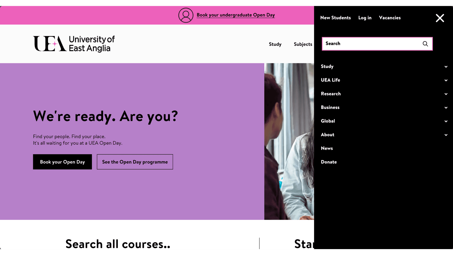
The University of East Anglia provided an example of how it can be done well. The side panel navigation, filters as well as the main navigation, were configured logically and conveniently for users relying on assistive tech.
Tabs, accordions and carousels:
Tabs and accordions were frequently used across the university websites to organise content but implemented in inaccessible ways. How? On some university websites some tab sections weren’t announced, and once a user selected a tab, the screen reader continued through the rest of the tabs before reaching the content on the active one. This made it hard to identify the active tab and its content.
Carousels were another pesky component from an accessibility point of view. These were often not announced as carousels to screen reader users. And on some sites, it was unclear what each carousel slide contained or how many there were. While this might seem like a small issue, it can cause great confusion for users of screen readers.
Focus states:
While focus states were generally prominent on universities’ websites and had sufficient contrast, not all focus states were visible when active. This can be disorienting for users who might be tabbing through and suddenly can’t see the selected element on screen.
Bath University did focus states very well; ensuring they are prominent by using three indications (colour, outline and underline) and making the outline thick.
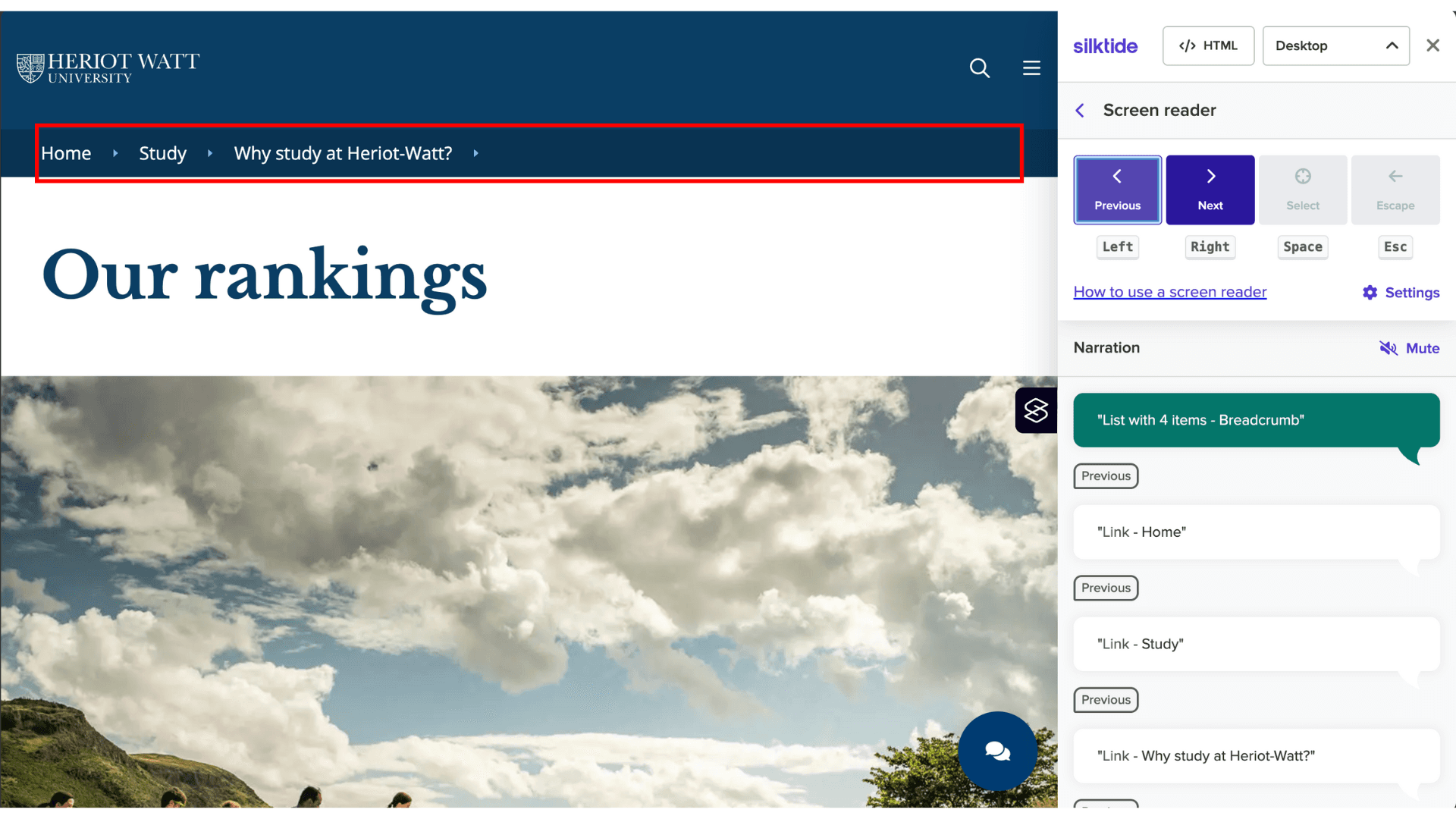
Breadcrumbs:
Most university websites used breadcrumbs. These allow users to orient themselves in the content-rich university websites and find their way wherever they land. However, the implementation of breadcrumbs wasn’t always screen-reader friendly with the breadcrumb region not announced by the screen reader. Instead, breadcrumbs were often announced individually as links.
Heriot Watt university did a great job with its implementation. The way the section is announced helps screen reader user understand that each subsequent link announced is part of the navigation path and shows their current location within the website’s hierarchy.
Tables:
When it comes to tables, screen readers offer announce the information within in a linear fashion. As a result, users have to remember the corresponding column title to understand what the information being announced to them is about.
This is perhaps a small issue when it comes to the simple two-column tables that are used on university websites to share fee information. But it can create significant friction for those with cognitive impairments or with more complex tables.
The best way for tables to be implemented is for the screen reader to announce the corresponding column title before the individual cell content. This way, users can navigate tables in a non-linear way and understand what information they are reading at all times.
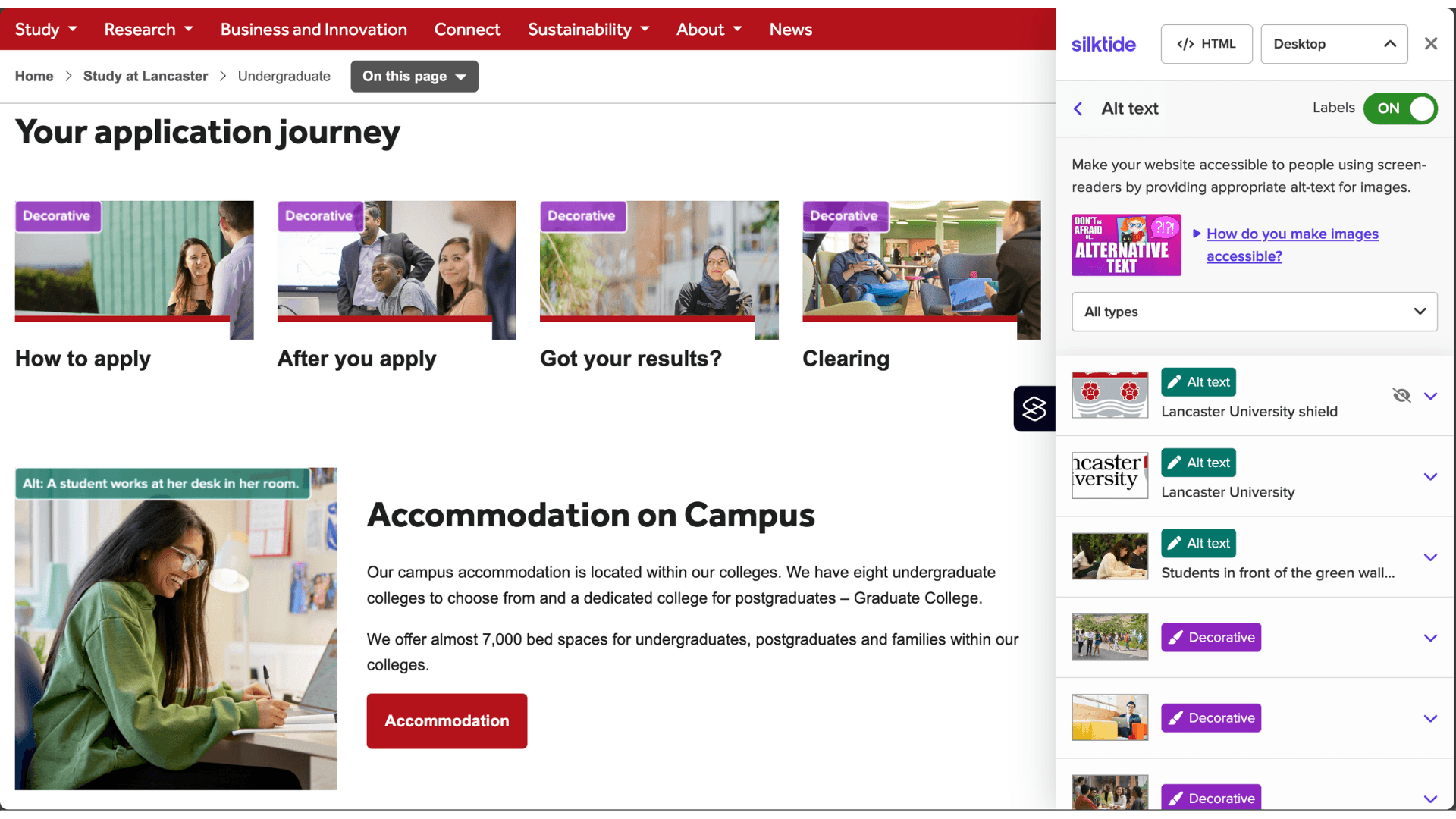
Screen reader noise:
Repetitive announcements of adjacent text and image links to the same destination adds clutter for screen reader users and spoils the experience. Noise also arises when images aren’t marked as decorative, or when cards with images aren’t implemented in a consolidated way.
While alt-text implementation varied widely, and some had issues with card implementation, Lancaster University did a great job with their implementation of both. The site avoids multiple, repeated announcements of links that point to the same destination, and their alt-text adds meaningful and unique information where relevant.
Link text:
Screen reader users commonly rely on the links on a page to understand page content. Non-descriptive links, like ‘Read more’, takes that ability away from them.
While most universities performed well on this, Strathclyde University stood out, with descriptive link copy that made sense without requiring any additional context.
Non-technical elements that support decision-making for students with disabilities
Enabling prospective students with disabilities (and their families and carers) to find the information they need on a university’s website is of paramount importance. Just as important is content that’s aimed at students with additional needs, helping them feel supported and giving them a better idea of what to expect before they arrive.
Checklists that include what prospective students with disabilities would need to do once they have enrolled, as well as before and after they arrive, can be particularly handy. Having it all in one place reduces the stress of having to search for this information across multiple pages.
This one from the University of East Anglia is a great example of how it’s done.
Likewise, testimonials from other students with disabilities, as well as opportunities to connect with them can inspire, offer reassurance, and provide helpful information to students and their families.
‘What our students say’ page from University of Dundee does this well by sharing accessible videos of students with a range of disabilities where they talk about their experience at the university.
It’s also important to reassure parents who might be nervous or overwhelmed by the idea of their child moving out. A page that informs them about the safety of the campus and provisions in place to make the student experience as smooth as possible, would be helpful in alleviating any concerns they may have.
Summing up
All in all, universities are doing a good job in terms of digital accessibility. However, there is still work that needs to be done to make the experience as seamless and stress-free as possible. This is important not just for the students, but universities as they compete for a shrinking student pool.
Expanding the pool of prospective students can also help universities address the financial challenges they are facing. Plus, it aligns with universities’ moral obligations by creating a more equitable workforce that gives everyone the opportunity to participate and thrive, regardless of background or ability.
Methodology:
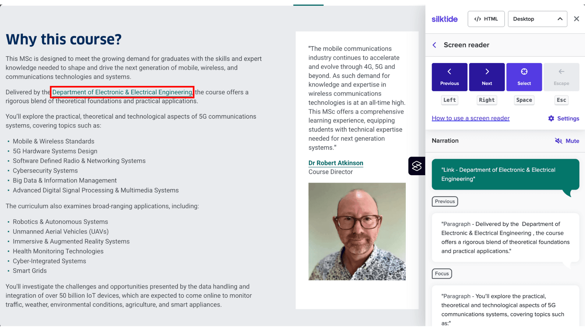
We reviewed the websites of 20 universities, using accessibility tools like Acquia’s Web Governance to rank them and get a quick idea of the areas where they failed meeting WCAG 2.2 requirements. A manual audit was then done for keyboard and screen reader navigation using the Silktide plug in.
Lastly, an understanding of the attitudes, needs and wants of visually impaired students when it comes to university studies was gathered from relevant online forums and blogs like catchthesewords.com
Our latest research, Clearing 2025 - A high-stakes digital battleground for UK universities, dives into the digital performance of 20 non-Russell Group universities during peak clearing, a moment when every click counts.


