Website information architecture: define a lean approach
Your UX is only as good as your website information architecture. Here lead UX consultant Nazar Ali Khan explores explores an information architecture framework that ensures your information architecture evolves in line with the needs of your users and the business.
What is information architecture?
Every great user experience is built on the foundations of a well-organised information architecture. After all, a user’s ability to journey through your site or app, and find the content or product they’re looking for, depends on it.
What is information architecture? It’s about defining content, organising the relationships between items of content, and giving these items meaningful labels. Your navigation and interactions will then spin out from this.
Well-structured information architecture is the foundation for compelling user experiences, whatever the channel, and especially as your users shift across different channels and touch points.
Why website information architecture evolves over time
Here at Inviqa, we’re often approached by brands looking to understand how they can better organise their website information architecture.
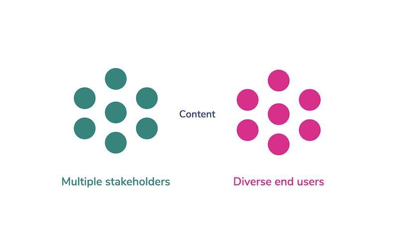
This might be because perspectives within the business have changed, or because the existing model for organising content was never really pre-defined and has emerged over time. In many cases, companies have multiple stakeholders generating content for a diverse group of end users.

The onus is often on end users to find what they need – something that negatively impacts both the usability and usefulness of the site.
Now, we know that the best design strategy sets out to achieve the objectives of an organisation by meeting the needs of its end users.
So, as part of this strategy, can we use a website information architecture framework that's systematic, repeatable, and lean?
This is the foundation for establishing a simpler, smarter ways to organise in line with your users’ needs:
- Systematic: a methodical approach that creates a sound rationale for organising content, particularly when there are many voices wanting to be heard.
- Repeatable: being able to repeat an approach will go some way to validating it, and give you a framework for looking at similar problems.
- Lean: taking a lean approach enables a project team to develop a shared understanding of who they’re designing for at the early stage of the project.
A website information architecture example
For websites that serve as an information resource, finding the best way to organise and surface content for end users and their needs is paramount. And this process starts with bringing together stakeholder groups to clearly identify who those end users are and their individual needs and expectations.
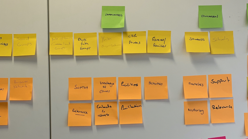
This is something we did here at Inviqa with a prominent UK charity. Following a series of stakeholder workshops, we set about analysing the lanes of post-it notes on the wall. From this, we were soon able to take the large number of users that had been identified and consolidate this into user groups based on their shared needs.

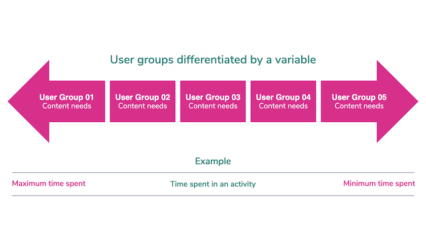
We then organised these groups along a scale based on their behaviours and content needs, using a common variable to differentiate them. We proposed this as a system for organising content at the early stage of the project, with each point along the scale representing a content category.

This proposal could then be tested as a hypothesis using methods such as card sorting and tree testing with research participants. At the early stage of the project, though, we had been able to create an objective way of organising content that addressed both our end users and stakeholders.
Create a website information architecture framework
Once you’ve found a method or system that works, keep it in your back pocket as a handy framework for solving similar problems.
We undertook another workshop with stakeholders at a different organisation where we were asked to look at the design of two new sites to sit alongside an existing news and content site.
We ran a similar exercise, and we were able to use the same system to organise the end users and their needs, although this time based on a different variable.
In this way we were able to show how content could be distributed without duplication, which was a key concern for some of the stakeholders.
As a bonus, we were also able to surface content that highlighted the diversity of services offered by the organisation, which we discovered during our workshop sessions.
Keep it lean with personas and archetypes
The website information architecture method we kickstarted with the charity organisation was also invaluable for generating personas and behavioural archetypes from the output of user research interviews.
Creating a common data structure for each persona or archetype, we can give values to attributes within these common structures, based on findings from our interviews.
The personas or attributes can then be organised relative to each other, using a scale again that relates to their behaviour or attitudes – and we can then identify the types of content or products that would best suit their needs.
The benefits of taking a systematic approach is that it creates an objective rationale for organising content, particularly when there are many people with a stake in that content.
Optimise your website information architecture
Website information architecture provides a key foundation for compelling user experiences, but it’s an area of experience design that’s overlooked, and where business and stakeholder needs are put ahead of the needs of your users.
Getting it right means:
- Starting with a clear understanding of your end users and their needs
- Looking for patterns or trends that help differentiate these within a system
- Distribute content based on needs, rather than how it's classified
- Creating a meaningful relationship between content categories and what they contain
Content editors can then think about how to purposefully distribute content across a site.
Using a system to do the heavy lifting allows content with value to be surfaced – and that’s a win-win for your for end users and stakeholders alike.
You might also like...
- A guide to recruitment for user research
- You user testing FAQ
- Best practices for your quantitative survey


