How good university website UX can solve student pain points

Good university website UX (user experience) can make all the difference to applicants at a stressful time in their life; as they are trying to decide which institution will be an enjoyable place to study and set them up for career success. Prospective students are increasingly reliant on a university’s website to answer the fundamental question, “Is this the right institution and course for me?”
Many factors determine whether a university is ‘the right one’ and these need to be addressed during both the decision-making process, and once a student has accepted their place. Being digital natives, today’s students will narrow their choices online and first look to universities’ websites for information to help them make decisions.
And therein lies the hurdle: a lot of university websites leave something to be desired, making it difficult for prospective students to find, absorb and return to key information to be confident in their decision. If universities want to attract and convert more students – both domestic and international – there are fundamental UX pain points that need to be addressed to improve user journeys and allow individual universities to stand out in a crowded market.
Poor information architecture and content structure on university websites
University websites, by their nature, contain a lot of information. This content needs to be structured in a way that supports easy navigation and discoverability. It is an area where even the most prestigious universities in the world have work to do.
Having reviewed many UK university websites as part of our work with higher education clients, it’s hard to find one that represents best in class, with many featuring unorganised content, poorly structured pages, and walls of hard-to-scan copy.
Ideally, content should be broken up into easy-to-scan sections. Can the copy be turned into a bullet point list rather than long paragraphs? How could you differentiate key ‘need to know’ information from information that’s relevant but likely to send a student on a side quest?
Based on insights gleaned from user research into university websites (and our knowledge of UX best practices), key things to aim for include:
- A clear navigation menu and structure. This makes it easy for users to move around the site and find the information they’re after.
- A consistent content architecture. While it may feel boring to you to have every page structured the same way, it makes it easy for people to know where to look for specific information.
- A considered content structure. It should mirror prospective students’ priorities and the key information they’re looking for at this stage of the journey. Having information like course costs, entry requirements and employment opportunities front and centre, rather than buried at the bottom, can help students quickly identify suitability.
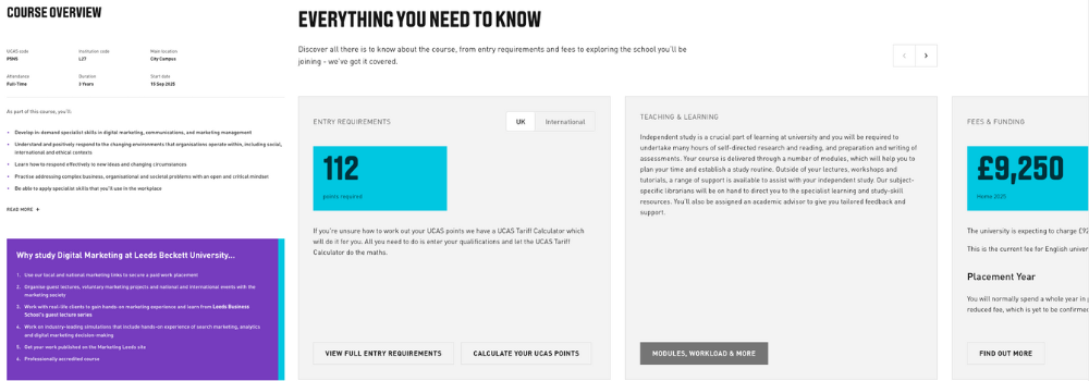
Leeds Beckett University has a course information page that’s a good example of well-structured, scannable content.
Key information about the course is called out, listed in bullet points, making it easy to scan and absorb. Further down the page, an entire section is dedicated to entry requirements and costs, credibility of the course and links to further information about workload, core courses and even a virtual tour of the teaching facilities.

A glimpse into the on-campus experience from afar
For some students, visiting a university campus may be plausible if they live nearby or are prepared for a road trip. This isn’t the case for everyone. International students made up 26% of the UK university student population in 2022/23 and don’t always have the opportunity to visit the UK at all, let alone all potential universities they want to consider, before making their final selection.
For these students, a virtual tour can help with the decision-making process, giving them a glimpse into what the campus and surrounding area are like. It can also be a useful tool to help domestic students narrow down their university choices and determine which they want to visit for Open Days etc.
In setting up a virtual tour – you want to ensure it’s an actual virtual tour, and not simply a selection of videos. The Arts University of Bournemouth’s website has a great example of what this could look like. Its virtual tour allows visitors to virtually wander through its campus as well as the surrounding town to get a feel for the area. Stylistically, it matches the arty vibe of the university.

Addressing the fear of “Will I like it here?” can also be supported through user-generated content – including videos from current or past students showcasing a ‘day in the life’ and providing a genuine snapshot into what student life is like.
Considering parents within your university website UX
Often, it’s not just down to a student which university they attend. Parents – particularly if they’re paying (and even more so for international students) - will want to be reassured that your institution supports academic and career aspirations.
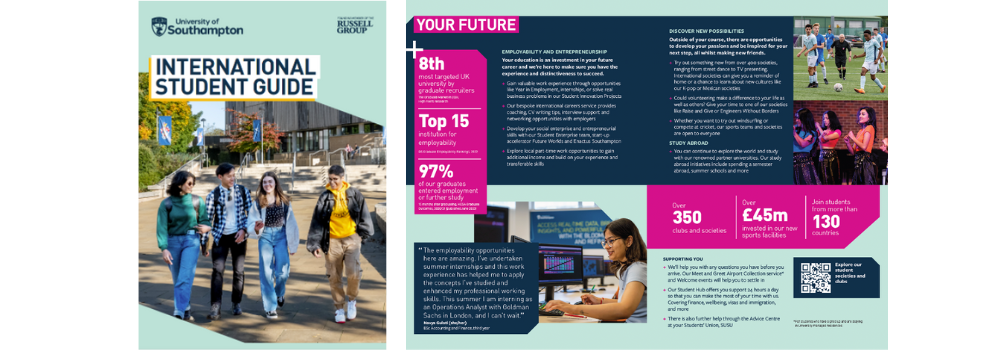
A section of the website or downloadable guide that highlights the university’s credibility, employability of students and other credentials can support students needing their parents’ approval. An example of this is the University of Southampton’s downloadable PDF, which focuses on the core information a parent might be interested to know about the university in an easily digestible guide.

Building direct relationships with students
Once students are in the application process, they will be inundated by emails. Most of it generic. Most of it ignored.
A large part of this lack of engagement comes from a lack of personalisation - establishing a direct relationship can be difficult with applications going through UCAS and universities therefore not owning the student data.
Universities should look for other ways to establish direct relationships with students through conversion opportunities via their websites using the information gleaned to create personalised, targeted communications and journeys.
And if email communication just isn’t getting the desired cut-through, it’s worth exploring other communication channels. Gen Z might not be keen to answer a phone call, but they’ll probably engage through text or WhatsApp if that’s an option available to them.
Continuing student communications once university offers are accepted
On the flip side, students we’ve talked to mentioned that communication from universities falls off a cliff once the application process is completed and they’ve accepted their place, making the whole experience feel transactional.
Keeping the information flow going at this stage, however, is crucial. This is the time they’re most likely to experience buyer’s remorse, so use this as your opportunity to reassure them that, yes, they did make the right decision by keeping up the communication and letting them know they’re already a valued member of the campus.
A university’s digital presence, particularly its website, is often the first place students look for information about the university, its courses, and how it can help shape their future. Therefore, it’s imperative the user experience supports this. Make information easy to find with logical and consistent information architecture, scannable copy, and highlight key points so students can quickly see how your university supports their aspirations – academic or otherwise – and help them determine whether your university is the right choice for them.
Discover How Exceptional Website UX Can Transform Your University’s Appeal
Ready to see how a well-designed website can attract and convert more students? Get in touch with us today and one of our team can take you through our comprehensive research into university website UX and showcase what exemplary user experiences could look like. Then, start the discussion on what improvements could be made to your site to enhance its UX and make a lasting impact on prospective students.


