

I was recently asked by colleagues to share my ultimate principles for digital design. The resulting presentation went down well, and I was persuaded to make this accessible to a wider audience – hence this blog post!
These nine design principles focus on three key elements of effective digital design: purpose, composition, and expression.
So let’s get stuck in!
1. Design with intent
A wiser man than me once said that you should ‘begin with the end in mind’. That wise man was Stephen Covey and these words are taken from his bestselling 1989 book ‘The 7 Habits of Highly Effective People’ where he describes the successful character traits of those who envision an intent to their work, and seek to measure against its success.
The implication here is that a design’s aesthetic can be composed so as to elicit a predetermined, desired response.
But in the world of design, things are a bit more nuanced. After all, your medium is flat (or digital) and therefore lacks the complex, three-dimensional properties that exist in a tangible object or space.
So the subtlety of intent in design is trickier to define, but let’s try.
At Inviqa we realise ‘intent’ by taking a goals-driven approach to technology engineering. We focus on the user behaviours we want to enact with our code (‘behaviour-driven development’) and we take a ‘build, measure, learn’ approach where you define the goal, then work towards it rapidly and incrementally, measuring the outcomes as you go.
The same methodologies can be applied to visual design.
Being more goal-oriented and customer-centred is the raw essence of designing with ‘Intent’. Beginning with an intent in mind means establishing a metric and goal (or goals) that can be measured as you progress through your work.
In our line of work, the end goal is often related to conversion. ‘Conversion’ implies a positive impact derived from your design, either by reducing something (such as bounce rate), or by improving a metric (such as awareness or engagement). Conversion goals can be varied in character, but they’re usually financially motivated.
Once you’ve established a measurable goal, you can begin to work towards it. You have your direction of travel or ‘pole star’.
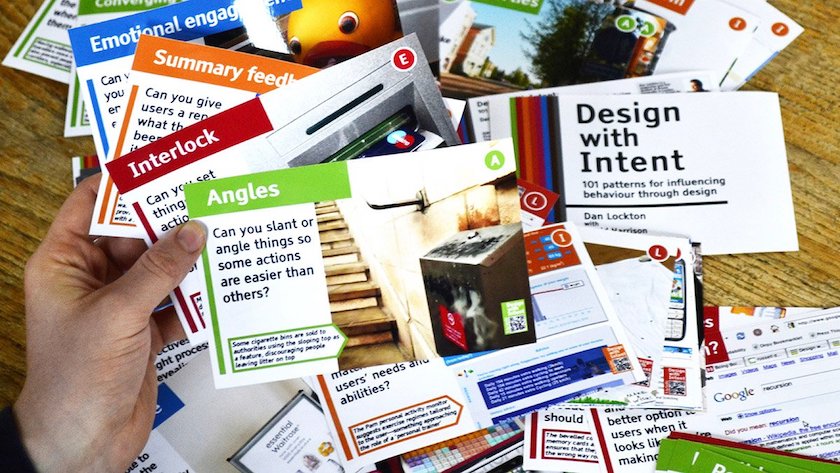
For further reading on this, do check-out Dan Lockton’s ‘Design with Intent: 101 ways for influencing behaviour through design’.
2. Context is king
In 1996, Bill Gates coined the term ‘Content is King’. In the decades between then and now, mobile and smart technologies have revolutionised the relationship between brands and their customers.
The contextual ‘how’ we communicate, and what form that experience takes, has become as important as the actual content being delivered. ‘Context’ has therefore seemingly usurped ‘Content', to reign as the new king.
For any design to be successful in its intent, the context in which the design is being received is critical in order to be understood or interpreted correctly.
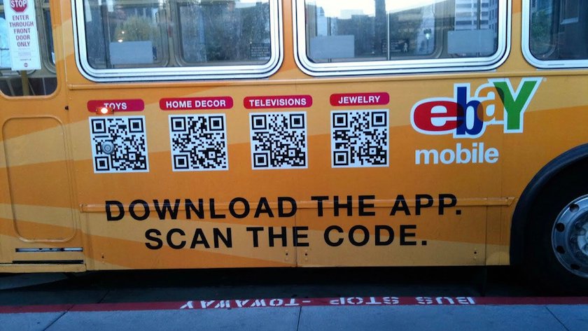
As an example, using 10pt text on a roadside billboard is wholly misusing the context, as passing cars have no hope of reading your content. Likewise, so is placing QR codes on the sides of moving buses; by the time you’ve opened your QR reader the bus has moved off.
Good examples of contextual usage are widespread, but primarily congregate around the most appropriate use of digital device, followed by the environment in which the design is consumed (is it a fast-paced or slow-paced environment? Is it the best location? Is the audience prepared to engage?) and finally time (either time of day, topicality, or longevity).
This being said, context can’t always be controlled once a piece of design is released into the world, and it’s difficult to remove retrospectively. That’s why thorough, upfront planning is key to avoiding pitfalls or negative interpretations of your design.
3. Focus on clarity
As a 12-year-old, I’d never have guessed that the words of my Geography teacher, Mr Fanthorpe, would stick with me throughout my professional career. But his strict mantra for every lesson still rings true today: ‘Make it simple, clear, and accurate’.
Mr Fanthorpe would accompany his mantra with a useful analogy. This was an insistence that, when we drew arrows to annotate maps, the ‘pointy end’ of our arrows were ‘sharp enough to kill’. We were subsequently marked down if our arrows were too rounded and blunt as they would ‘bounce off’ the target. (This was the ’80s, mind).
This visual metaphor has always summed up ‘clarity’ for me with respect to digital design. Your clarity of execution must be clear and accurate. Reduce the bluntness; be precise and directional.
Ordinarily, simplicity would be paramount, but experience in the field of digital design has taught me that ‘accuracy’ and ‘clarity’ are more realistic aims than ‘simplicity’. This is because the challenges we face as digital designers are augmented by complex factors such as user interaction, screen resolution, performance speed, and technical feasibility (amongst others).
‘Simplicity’ is therefore the ideal, but ‘clarity’ is more realistic as an objective, as it permits this level of digital complexity, whilst also striving to deliver design with clarity of intent towards achieving our predefined goal.
4. Find the space
If clarity is important, then it can only be achieved through a clear understanding of the use of space in design. An inability to manage space will inevitably result in ‘bad design’ that is cluttered and lacking focus.
When considering space, I’m always reminded of the 1974 Dutch National Football team. The team’s approach centred on continually creating space – either by moving into an empty space, or standing still to allow space to exist. The result was a holistic view of positive and negative space over a large surface area, and ‘find the space’ became their mantra.
The same is true for design. It’s important to see the big picture as a combination of positive and negative space. Leave ample room for elements to ‘breathe’, so that the negative empty space allows the eye to focus on the positive elements.
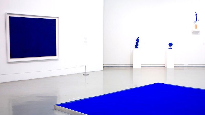
Imagine an art gallery or museum. By leaving the majority of the physical space white (or neutral), the curator can draw attention to the pieces on display. The emptiness is as important as the objects themselves since; it provides the neutrality that allows the positive to stand out.
5. Create balance
Fail to use space correctly, and the resulting piece of design will appear unbalanced, even to non-designers.
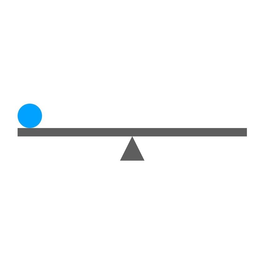
From an early age, the human brain becomes particularly adept at noticing things that are out of balance. Take the below image, for example. It’s simply a line, circle and triangle – nothing more – but our intuition automatically tells us that the diagram is out of balance, and that the ‘see-saw’ will tip to the left.
As design professionals, we must instinctively seek to create balance in our designs to make them pleasing to the eye. A balanced piece of design, combined with the smart use of space, provides a solid structure and foundation on which to create your designs.
6. Use contrast effectively
Now that we have a framework in place, we can begin to work within the structure we have defined.
Until this point we’ve been discussing ‘harmony’, both in negative and positive space, and a balance through equilibrium of elements.
Contrast seeks to use the structure created by that harmony as a canvas on which to express itself, creating emphasis, and drawing the eye towards elements within it.
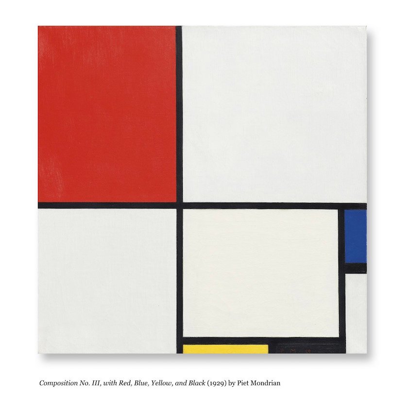
Contrast is strongly linked to the ‘intent' we talked about. Take the work of Piet Mondrian, for example, who was a master of using contrast in his compositions to create focus and deliver his intent.
Now, let’s look at when contrast goes awry.
Being over 40 and excitable means I’m naturally a fan of rave music. As well as some bangin’ tunes, this genre offers some of the worst examples of contrast in design. Take the below image. It’s not overstating things to say that this is the antithesis of using contrast effectively.
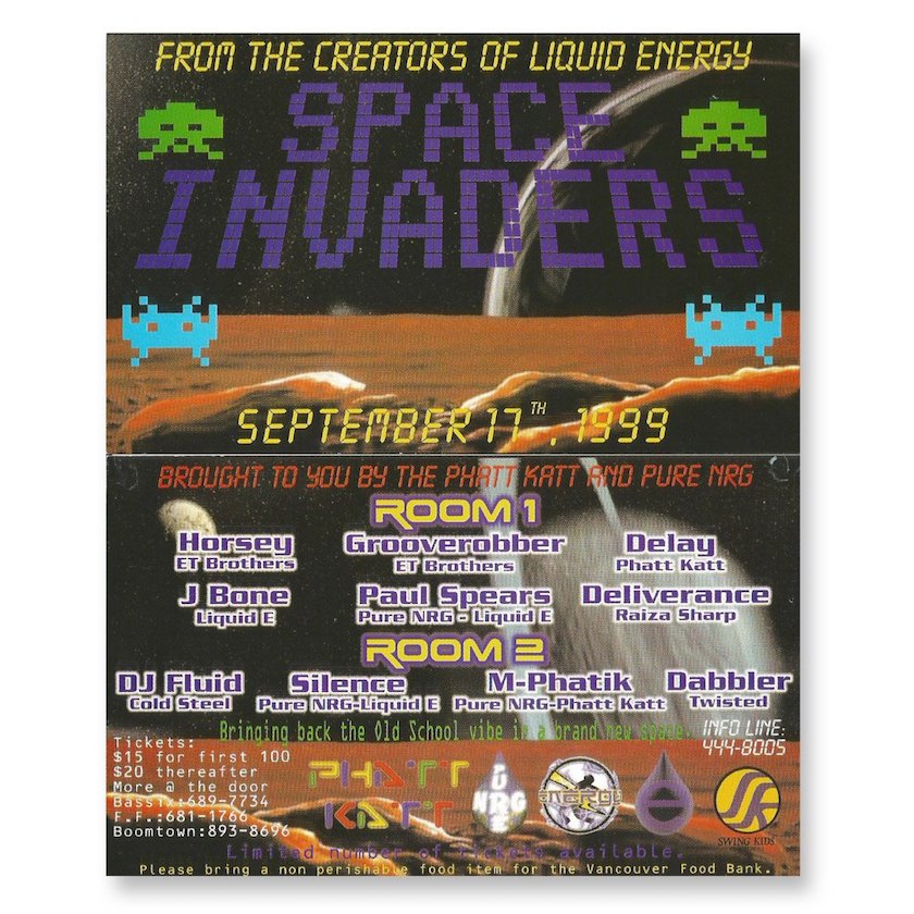
You could spend hours picking this apart, but let’s keep things brief: there are simply too many things on the page. The upshot is that you have no contrast whatsoever. Elements are not just fighting for our attention, there’s an all-out riot going on.
Given the volume of content it becomes difficult to focus on clarity, space, or intent. This can be a challenge that we find ourselves in on a regular basis as designers – figuring out how to make complex content seem visually appealing.
The remaining three points can in part help us overcome this.
7. Be consistent
When fighting the battle against complexity, the most powerful tool in your armoury can often come in the form of ‘brand guidelines’.
Assuming firstly that they exist (you’d be surprised how often they don’t), they will always contain some graphical element, device, or colour with which to get started on tackling that content complexity.
I’ve worked with dozens of brands in my career, but (as a dedicated student of The Bauhaus) I always find they fall into one of three categories: square, circle, or triangle.
Square brands (or linear) are the most common and often the easiest to design with, as they conform to a grid-like system of straight lines (see fig 1 below). The rigidity of them works well with strong blocks of colour, which can help divide the page into sections, into which you can place some of your complex content. Be careful not to make your design too predictable though.
Circular layouts are less frequent. They’re quite distinctive with respect to design and so a circular layout (see fig.2 below) should only really be used if the brand lends itself accurately to that style. Although circular layouts are infrequent, circular logos are very common, therefore a designer should be careful when approaching any layout that tries to mimic the circular nature of the logo you’re working with. You can risk ‘losing’ the logo. That only leads to unhappy clients and requests for larger logos!
Furthermore by using rounded shapes in your design, you reduce the useable space in which to place text and blocks of copy.
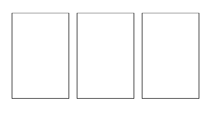
Finally, angular layouts, based on triangles (see fig.3). I’m 100% guilty of preferring this style as I love the dynamism they bring to a layout. Personally I enjoy exploring the angles that are intrinsic to the approach as they offer a vibrancy, movement, and a directional flow. However, it must be noted that angular layouts can rapidly become complex, and so require a good deal of control.
At Inviqa we use our ‘pinwheel’ device as the basis for our angular layouts. It has serious visual impact, but it is important to stick to the approved angles contained within the shape. To ensure this happens, we have the following gif as a guide.

8. Consider colour
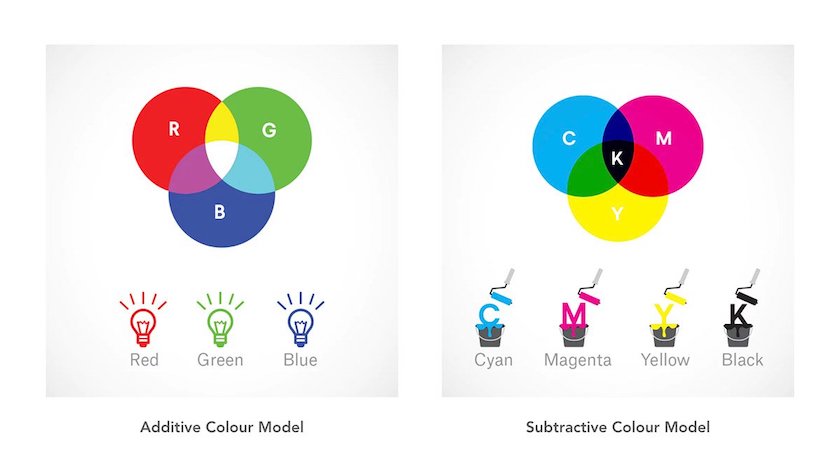
Colour theory is a widely explored subject, so I don’t really need to speak about this at length. That said, there are two practical applications to consider.
In this piece we have largely been focused on digital design. In which case, more often than not you will be encountering an ‘additive’ system. This is where light (in the form of a monitor bulb) shines through your design and is formed up of RGB colour values that combine to make brilliant white.
This differs from a ‘subtractive’ system that uses CMYK (or sometimes RGB) to print onto a medium such as paper. The colours, in this case, combine and are absorbed by the paper to become darker, not lighter, as the print opacity increases.
That might be a bit rudimentary, but it has a bearing on how you use the colour wheel to create colour combinations. Let’s quickly look at the three fundamental approaches.
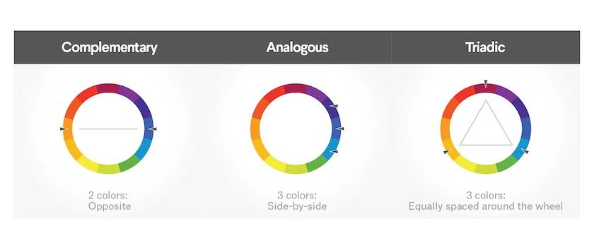
Complementary (two-colour): The sharp contrast between the two colours, either side of the wheel, can really make imagery or design ‘pop’ (red and green, for example). Be careful in how you use them though, as they can tire the eye because of their high contrast. You also lack a third colour, and thus white (or a neutral tone) might also be required.
Analogous (three-colour): Analogous colours sit next to one another on the colour wheel. One colour will dominate, one will support, and another will accent. This type of scheme is pleasing to the eye and can effectively instruct the consumer where and how to take action.
Triadic (three-colours): Triadic colours are evenly spaced around the colour wheel and tend to be very bright and dynamic. They create visual contrast and harmony simultaneously, making each item stand out whilst also making the overall image pop. Again, ensure that you temper the dynamism to not lose the contrast, clarity, or intent.
9. Let text breathe
There are hundreds of fonts available to use, but this doesn’t mean you should try all of them! I’ve met many designers who seemed to have been on intent in doing so.
To quote my typography tutor at art college: ‘Two fonts, maximum. Two weights, maximum’.
This advice has stood the test of time as it agrees with everything that we’ve written so far in this article. Essentially, if you need to rely on more than two fonts to create a good piece of design, then your design is fundamentally flawed. It’s either lacking space, contrast, clarity, or any of the other eight essences we have covered.
Likewise, if you feel forced to capitalise text, embolden it, or (God forbid) add drop shadows in order to make it stand out, then you should refer back to the structure and balance of your design, because something basic has gone really wrong somewhere.
Typography isn’t just about fonts of course, there are many aspects to consider, such as alignment, line height (leading), and character spacing (kerning).
Again I quote my typography tutor when I say ‘let your text breathe’, ‘don’t make it a challenge to read’, and (his favourite) ‘centre-aligned text should only be used on menus… and wedding invitations’.
10. Wrapping up
With that chastening mantra resounding in your ears, we’ve reached the end of our Design 9! Here’s a reminder of the big nine:
Design with intent
Context is king
Focus on clarity
Find the space
Create balance
Use contrast effectively
Be consistent
Consider colour
Let text breathe
I hope you find value in applying these principles across your own digital design work. Thanks for reading!


