Designing for accessibility and inclusion: from compliance to inclusion

Understand how to progress from compliance to true accessibility with this guide to designing for accessibility and inclusion.
The difference between designing for accessibility and inclusion
There are clear financial, legal, moral, and usability benefits to designing for accessibility.
We won't go into that here. But if you need a refresher, check out our talk on how to build a business case for accessibility.
So what do we mean by accessibility? Well, in a nutshell, accessibility is about usability. It's about making sure that your site or app is easy for everyone to use. Including people with permanent, temporary, or situational impairments.
But usability is not the only way that people are excluded. That's why it's important to understand accessibility within the wider context of digital inclusion.
Digital inclusion looks beyond accessibility to how we achieve better digital products by designing for the full range of human diversity.
Designing for inclusion focuses on relevant, authentic engagement with people. By actively welcoming diverse people.
Of course, you can't be inclusive without also being accessible.
So accessibility – and in particular, technical compliance – is a great place to start.
Designing for accessibility starts with compliance
Complying with accessibility guidelines doesn't guarantee that your site is easy to use for people with disabilities.
But it's still a great way to lay the groundwork for a more accessible product that ensures better outcomes for you and your customers.
And it's easier than you might think. We have internationally recognised web accessibility guidelines like WCAG 2.2 And we have the principles of semantic HTML.
Together, they allow developers and content creators to deliver experiences that can be understood by assistive technology such as screen readers – and alternative input devices.
Compliance starts with doing an accessibility audit. And there are a wealth of tools and resources out there on how to do an accessibility audit.
An accessibility audit and accessibility consulting are important parts of your digital accessibility journey. But they’re not the whole story.
To create truly inclusive digital experiences, you need to embed the core principles of accessibility into everything that you do.
Think bigger than accessibility guidelines
To be truly accessible, you need to understand the needs of people with a wide range of disabilities and impairments. And what it means for a site or app to be accessible.
Web accessibility guidelines like WCAG are an approximation of these two things. Implementing them is no guarantee that everyone can use your product or service easily.
A compliant site is not necessarily accessible. Until you test your site with real people (with real accessibility needs), you won't know if it's truly accessible.
To be truly accessible, you need to meet the needs of people with specific disabilities and impairments.
To help you think about what this might mean for your organisation, check out this Apple promo. How many product features can you spot that benefit people with impairments?
Imagine if these features didn’t exist. How would you feel if you couldn’t do what you came to a site or app to do?
Would you tolerate the bad experience? Or take your business elsewhere?
An inclusive digital experience should delight and satisfy all your users. Attract new people. Keep existing users coming back for more.
Make accessibility a non-functional requirement
Putting accessibility on an equal footing with performance, security, and other non-functional requirements ensures it gets the attention and focus it deserves.
So, when you decide how your product will function, make sure accessibility is part of the discussion.
Here are some examples of non-functional accessibility requirements that you could use:
- The product must be usable with only a keyboard.
- All meaningful content must be available to screen reader users, in the correct order.
- All non-text content must have a text alternative (alt text).
- The product must give all users adequate time to complete their intended action.
- All form fields must have a clear purpose, with visible labels and help text provided where additional context is needed.
- All content and functionality should have multiple ways of navigating to and from it.
Decided what your non-functional accessibility requirements should be? Now you should determine:
- How will they be enforced? Will failing to meet these requirements block a new feature from going live? If not, why not?
- Who will enforce them? e.g. product owners, the whole team, dedicated accessibility advocates
- How will they be measured? e.g. auditing, user testing, automated testing
- How will problems be fixed? Will you have enough time and resources to make the necessary changes?
How to progress from technical compliance
There’s far more to designing for accessibility than meeting guidelines and best practices.
There's a clear opportunity for innovative organisations to create experiences that actively welcome diverse people.
A good example is the prototype we designed for a cruise booking site.
Most cruise companies make you use a map interface to book your room on a cruise ship.
But imagine trying to do this with a visual impairment. Or if you're unable to use a mouse.
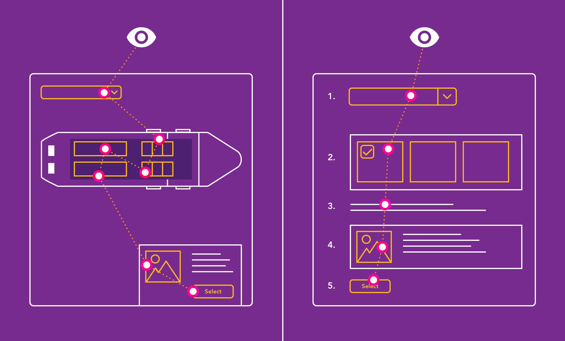
That's why we helped our client create an accessible room selection tool. It allows users to choose what type or grade of room they want. They can then choose the deck and room number.

The diagram on the left here shows the original, map-based interface which doesn't meet accessibility needs.
On the right is the new user journey, which makes it easy to find the right room based on your criteria.
The new process is split into two steps. And is text-based, not map-based. As a result, a much wider group of users can use the service and have a satisfying user experience.
Creating inclusive digital experiences means doing more than the bare minimum.
You need up-front research. You need to uncover what your users need. Design accordingly. Deliver an experience that fully meets those needs. And test with real users as you go.
Think outside the viewport
An accessible website or mobile app may not be the best tool for the job. What if the most inclusive digital experience doesn’t involve a screen at all?
A great example of this is the Virgin Trains Alexa skill.
The Virgin Trains Alexa skill helps people who would struggle to access train times via a screen. But it also provides a convenient interface that everyone benefits from.
Voice assistant platforms enable organisations to reach a large pool of users who can’t, or won’t, use computers or mobile devices.
Some users avoid screen-based devices because they don't have the assistive technology. Others prefer real-world or phone interactions. In these cases, well-designed Voice UI experiences are a great alternative.
Beyond this, voice assistants are great for anyone with a situational impairment. For example, someone who's driving. Washing up. Holding a baby.
Before you decide what experience to create, start by considering the needs of your different users.
Design one or more solutions that fulfil those needs, remove barriers, and delight all of your users.
How to start designing for accessibility and inclusion
Web accessibility guidelines like WCAG are very important resources.
They help us understand everything that we can and should do to ensure our digital experiences cater for everyone and comply with the law.
But compliance is the bare minimum. It doesn’t prove that your site is easy for a wide range of people to use. And compliance alone is meaningless without using accessibility testing to confirm your efforts worked.
So approach compliance as the start of your digital inclusivity journey.
But remember that digital inclusion means embedding accessibility principles into the fabric of your processes and thinking.
SSE Energy on how to embed accessibility


