Design for one-hand use and remove friction in mobile apps
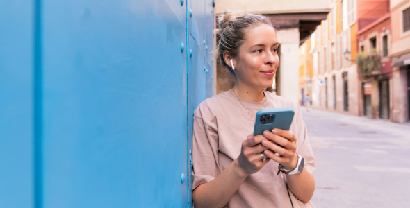
Have you ever been on a WhatsApp message and tried to go back using one hand? The back arrow is just a bit too far away so you resort to gesturing (swiping from the edge of the left to right) or using the other hand. What about when using iMessage and you are forced to reach out to the top to create a new message? In fact, most apps these days have their search function or menu bar inconveniently out of reach. Having our phones in one hand means limited reach on the screen, and often requires stretching or bringing in another hand which demands more attention and creates a less positive user experience. We expect our phones to be easy, usable, and seamless yet the growing use of phone grips demonstrate there are still design issues that need to be questioned and improved upon.
Growing pains: the phone grip
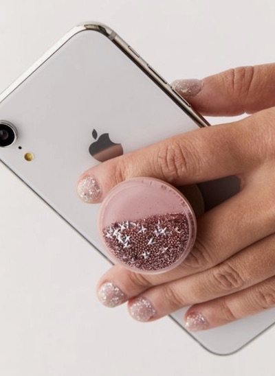
Since the release of one of the most groundbreaking phones in history, the first iPhone, screens have increased substantially in size. The original iPhone was 3.5” (90mm); the iPhone 12 is 6.1”.
The growth of devices and their screen size have spawned, in my opinion, one of the worst inventions ever: the phone grip. They are popping up on the back of phones everywhere because people need them to be able to hold their new, bigger devices in one hand. Industrial designers have devoted themselves to crafting great phones that are meant to feel and look great on their own yet the uptake in phone grips is evidence that there is still a lot of work to be done and many people are not happy with the standard, out-of-the-box device.
One-hand usage
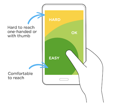 I believe we need to at least question whether we are creating the best and most well thought-out experiences and better understand the context in which user actions are being performed. Most of us use just one hand for scrolling through social media and emails etc, with a very limited thumb reach. This means you can comfortably reach the bottom of the screen but struggle to reach the top.
There are a lot of apps that are changing their interfaces to better recognise this fact. For instance, the Apple Photos app has the core navigation at the bottom of the screen. This allows you to filter and browse the app all within a thumb's reach.  It also breaks the common feed convention and places the most recent photo at the bottom rather than the top. Everything core to the app is all within reach of your thumb and easy to use with one hand, while the lesser used UI sits at the top. An additional good feature is how Halide, the main camera screen and the main purpose of the app, has all its UI at the bottom of the screen so a user is able to easily take photos with one hand. It isn’t just Apple that recognises this fact. If you use the Twitter app, you can see how it makes use of the FAB (floating action button) at the bottom of the screen for the creation of a new tweet, with the main UI of the app right next to your thumb.
What is so frustrating is that the design teams at these companies clearly recognise a problem and create features to solve it, but they then go and make other features that contradict their good work, all within the same app! To take the previous example, Twitter has the FAB at the bottom of the screen, but the most recent tweets are still displayed from the top. This means that in order to reach a recent tweet and respond to it you may have to strain a little or use the other hand. Furthermore, the Apple emails app displays the ‘create new email’ icon at the bottom, but like Twitter, the most recent emails come in from the top of the screen. New iMessages rearrange to the top of the screen when they come in.
Redesign: how it would look
In usability testing it is common practice to observe and question how people interact with the product being tested. Do we as designers pay enough attention to how people hold their phone? Do we question whether they are struggling to reach elements and effectively navigate through the user journey? I believe we should start to ask ourselves, as a design community, whether it might be correct to now assume that people are using one hand on their phones and conduct user research and usability testing according to this default assumption. The result may be simpler and better experiences for the user.
I decided to take a live example from iMessage and redesign it using one-handed principles, taking inspiration from Apple Photos and tweaking the UI.
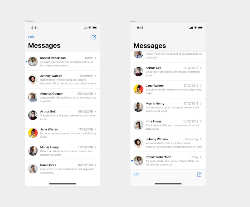
On the left is the current iMessage app, with the most recent message at the top as well as the creating a new message and ‘Edit’ at the top. On the right is what it could look like if we redesigned it for one hand use. Reversing the messages so the most recent is at the bottom as well as the 'create a new message' icon and 'Edit'. They are now all within thumb reach, making it one hand friendly and more consistent with the messages screen where the newest messages come from the bottom. If all interfaces were more like this, imagine how much easier and less stressful it would be using them and we would have no need for those phone grips!
Want to find out more about good digital product design?
Read more about how we use a range of usability testing methods and user research to inform our digital product design process.
Get in touch for an initial consultation
