
There are plenty of compelling reasons why you need to ensure your website is accessible. Besides the obvious compliance requirements with the upcoming European Accessibility Act, there are financial, legal and moral reasons for creating a site that’s easy to use by those who rely on assistive technology or have additional accessibility needs. Then there’s the fact that websites that are designed to be accessible provide better experiences for everyone. Yes, even you!
Here, we look at 5 web accessibility examples highlighting accessibility done well and what you can learn from them.
But before we dive in, if you need a primer on web accessibility, check out this video on the business case for accessibility or our digital accessibility report.
You might also want to explore this post on designing for accessibility, our response to the question why is accessibility important?, and this roundtable conversation on how to design for disability.
Now, let’s take a look at some of the sites getting accessibility right!
1. Scope
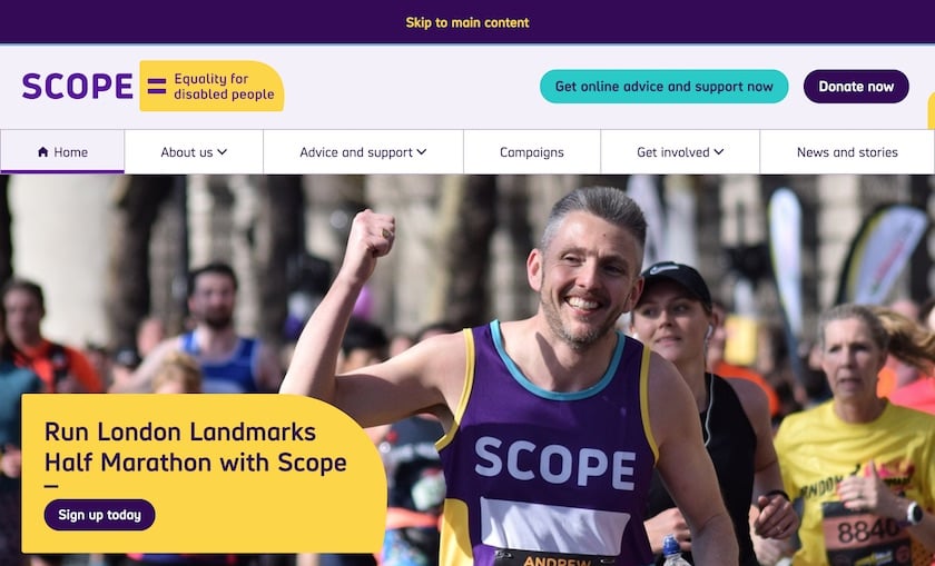
Scope.org.uk – the website for disability equality charity Scope – is a lesson in how to do keyboard accessibility well.
Try tabbing through the page. Observe the big ‘skip to main content’ banner that appears for the first tab.
Check out the transition styles when tabbing between elements. And the thick border on the focus indicator.
The site is also a great example of how to achieve a beautiful design that meets accessibility requirements.
Large, high-res, and captivating imagery is easy on the eye – even for partially-sighted site users. Colours are distinct. There's large font sizing and line spacing – and well-designed buttons.
One of the things we like most about this site is the ‘Accessibility’ page – which you can find easily in the main navigation.
The page sets out Scope’s commitment to accessibility, but also provides support for people who want to customise their experience.
We love the bullet point list of website accessibility problems that Scope is working to fix.
The approach is fully transparent and demonstrates Scope’s commitment to improve the experience of users with access needs.
2. SSE Energy
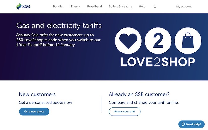
With an ageing customer base, SSE is embracing inclusive design. Its aim is to deliver a great digital service to all its customers alike.
SSE’s energy business focused its accessibility efforts on the online sign-up journey.
That's because it provides the most important and profitable user experience on the website.
As part of a redesign of this journey, SSE has gone back to basics. It changed key elements of its digital brand – including a significant revision of its brand colours.
SSE started with an accessibility audit, remedial code work, and the roll out of new design principles.
It then ran accessibility testing with real customers to drive out further improvement opportunities.
The result is a clear, clean, easily navigable design.
Tabbing for keyboard-only users works well. There's a prominent ‘Skip to content’ button on the first tab. And attention has been placed on code structure and alt text for non-text elements.
Check-out this SSE case study to learn more about how the organisation aims to provide inclusive experiences to all its customers.
3. BBC
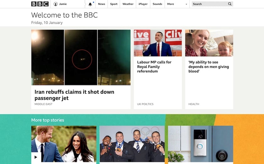
The BBC’s digital team is a strong advocate of inclusive design. This ensures that accessibility is an ‘integral part of user experience design’.
For the BBC, this means committing to:
put people first
add value for disabled people
prioritise familiarity and consistency
give control over content
provide different ways to interact with elements of the user interface.
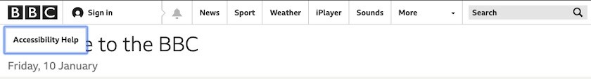
The BBC website includes a hidden ‘Skip to content’ link at the start of the tab index – that's revealed when you tab to it.
But there's also an ‘Accessibility Help’ link straight after. This ensures that keyboard and screen reader users – new to the site – can quickly find help. Without having to wade through the rest of the navigation.
The BBC website is packed with lots of small accessibility enhancements. There’s hidden text that gives extra context to screen reader users.
These include more accurate timestamps on article promos – and extended labels next to share icons.
As you'd expect, the site is very easy to navigate via keyboard. Care has been taken to ensure that assistive technology users aren’t exposed to adjacent links that point to the same page.
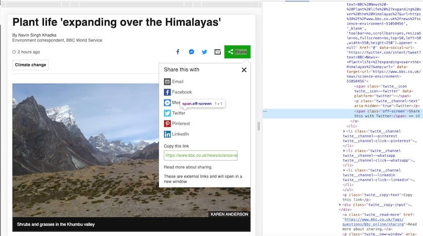
The above image is a great example of a small enhancement for screen reader users.
It shows a news article with its email and social media sharing menu expanded.
In the code inspector on the right of the image, you can see that the label 'Twitter' is hidden from assistive technology users using the aria-hidden property. And there's an offscreen 'Share this with Twitter' label in its place.
The BBC was also an early pioneer of responsive web design. The site works at every possible screen width. Page elements resize and stack fluidly as the available space decreases.
This isn’t typically thought of as an accessibility feature. But sites that have fluid page layouts are also extremely helpful for partially sighted users who increase their browser zoom level.
As you zoom in, the page layout slowly transitions from desktop to mobile – via an intermediary tablet layout.
No matter which zoom level you select, the content and layout stay in proportion to each other.
The BBC’s accessibility features aren’t limited to text and images, of course.
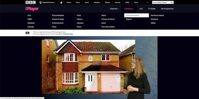
The flagship BBC iPlayer and BBC Sounds services are optimised for screen readers, keyboards, and alternative input devices.
All iPlayer programmes have subtitles. And users can find audio described and signed programmes via the category navigation.
4. GOV.UK
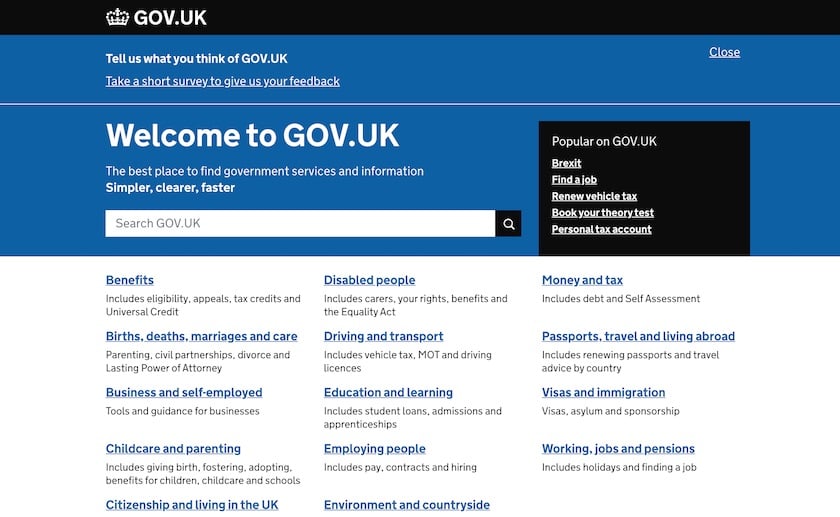
GOV.UK is another great example of how to do lots of little things to make the overall experience as inclusive as possible.
It has semantic and well-structured HTML. But it also has many small enhancements for screenreader and keyboard users to ensure they can make full use of the site.
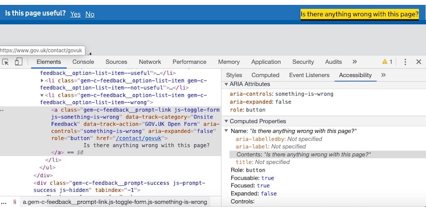
The feedback forms in the footer are hidden behind two links.
They make use of ARIA attributes to help screen reader users find the right form and fill them in correctly.
The ‘No’ and ‘Is there anything wrong with this page?’ links have aria-controls and aria-expanded="false" attributes to show that they control a nearby section of the page that's currently hidden.
When the feedback forms are opened, the first field in the form automatically receives keyboard focus.
In this instance, a screen reader would normally read out the label for this field – but skip past the help text above it.
To work around this, there is an aria-describedby property that points to this help text. This directs the screen reader to read out the help text at the same time it reads out the form label.
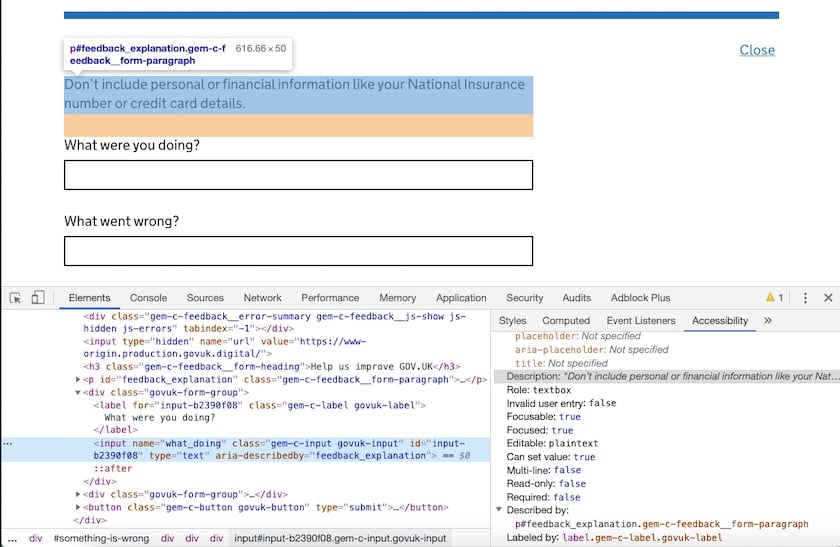
It’s also worth noting that the ‘Close’ button shown in the above screenshot has aria-controls and aria-expanded="true" attributes.
This indicates to a screen reader user that this is the mechanism to close the feedback form they just opened.
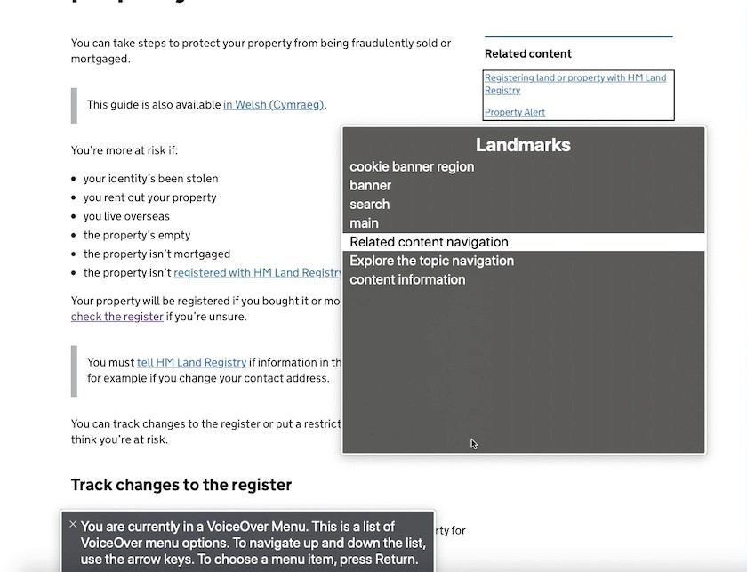
Some article pages on the GOV.UK website have ‘Related content’ navigation menus in the sidebar section of the page.
Screen readers like VoiceOver will compile a list of all the navigation menus on a given page so users can find them easily. But this is only useful if the navigation menus have descriptive names.
That's why the ‘Related content’ navigation element has an aria-labelledby attribute – which points to the adjacent H2 heading.
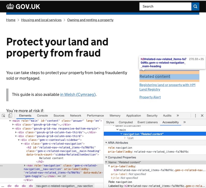
Using VoiceOver’s Web Rotor, we can see that the ‘Related content’ menu is correctly described when accessing the list of navigation menus on the page. All thanks to the aria-labelledby property:
Another enhancement that benefits screen reader users – among others – is alternative formats for numerical data and statistics.
Typically, this information is presented in a chart format – often with colour coding.
However, this representation of the data may not be structured in a way that screen readers can easily interpret. So users can switch to a table view of the same data.
The use of inline alternate views for data ensures that a wider group of users can easily access this information – without having to hunt for it or make any special requests.
Overall, the GOV.UK website is a great example of accessibility and inclusive design.
The accessibility statement and design system documentation demonstrates a commitment to equal access. It informs users how the site was tested – and identifies any issues they're working to resolve.
Their design system documentation warns potential adopters that implementing the design system doesn’t guarantee WCAG 2.1 AA compliance. And that each government service must do the necessary research to ensure their implementation is accessible in context.
5. Barclays
The Barclays website provides a great overview of how the business supports disabled people.
It details how they support specific impairments – and where they’re certified by AbilityNet.
The accessibility statement uses plain and simple language – and demonstrates their commitment to inclusive design. Tailored support is offered across all key touchpoints.
The site provides a helpful menu of visible skip links when you press the Tab key after landing on a page.
There are clear and bold focus styles. Plus a nice smooth scrolling animation. This makes keyboard navigation easy and comfortable.
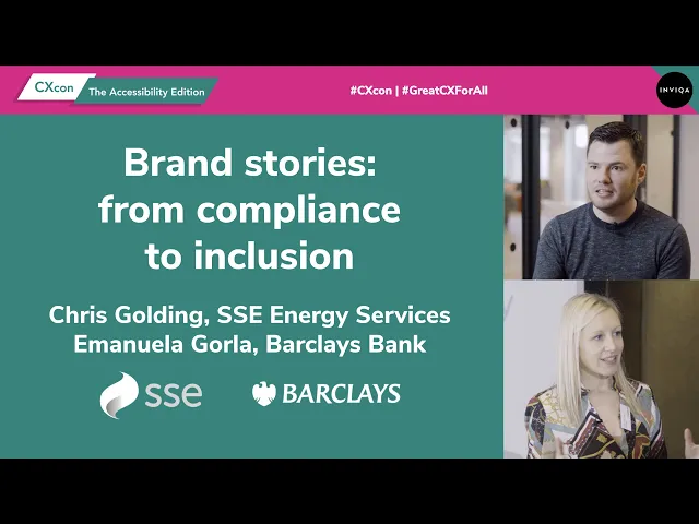
We spoke with Barclays’ former accessibility business partner, Emanuela Gorla, during our 2020 online accessibility conference. Check out the session to learn how Barclays is improving digital experiences for every customer, client, and colleague.
Wrapping up
These digital accessibility examples – and countless others – remind us that:
You can make your site work better for diverse people AND have an attractive website design.
Designing for diverse experiences makes your website better for everyone.
If you’re just starting your accessibility journey, we recommend starting with accessibility consulting and accessibility training.
An accessibility audit is also a great place to start.


